the hearts and laserbeams blog!

recently blogger decided we can't publish my blog to my own website anymore so here we are! pardon the dust, and please visit us online at www.heartsandlaserbeams.com!

hearts and laserbeams is the wacky good-times art and design by me, steph calvert. i team up with robots, cupcakes, and stick people to show people art isn’t all about seriousness, missing ears, and deep thoughts; it can actually be tons of fun.

5.10.2009

the voodoo that yudu so well - part 2: all the screens that're fit to print! AND A GIVEAWAY!

now that we've covered how to burn screens with the yudu, i'm gonna share my experiences today in printing a big ol pile of shirts for an order i'm putting together for shopscad in savannah, georgia! there's a lot of info to cover, but if you can hold on til the end i'll tell ya about a fun giveaway we're gonna do!

first up you start with a big ol pile of shirts and a few fabulously burned screens!

P1050630 P1050619

you'll wanna iron your shirts before printing on em so there's no weird wrinkles in the design, fyi be advised!
P1050634

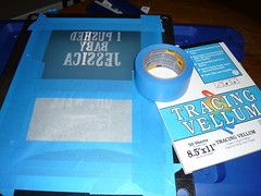
first of you'll need to prepare the screen by taping off all the areas you don't want ink to get through. i use ordinary 3m blue painters tape for masking off stuff because it's not super sticky and comes off really clean when you need to take the tape off. also, notice that i burn more than one image onto a screen - thisll save you a ton of money in the long run - figure a yudu screen is 25 bucks - if you put 4 designs onto 2 screens you've effectively saved yourself 50 bucks! such a smart shopper! you can use vellum, plastic, acetate, or heavy paper to block off designs you don't want to be part of your current printing. i use vellum. so if you wanna be awesome... uh... use vellum?
P1050637

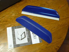
i would also totally recommend springing for yudu's better squeegee. it just feels better with printing. i'm willing to bet if you already do screenprinting you've got a squeegee you like and i'll be honest with you that shit will work. it won't make the yudu blowup! so relax!

money saving tip: i think the yudu means well with their platens you can buy a bunch of and adhesive sheets, but for my one-color printing uses i find it kind of unnecessary. i left the protective sheet on top of the platen's adhesive and i don't put the platen inside the tee when i print. rather, i put a piece of cardboard inside the tee and set it on the platen and print away. here's some info on lining up your images:

P1050638

see that dark shape behind the "i pushed" text? i put a piece of tape on the platen to mark where the top of the artwork is.

P1050641

then i jot down on the tape the measurement info on what points i want the tee to line up to to have proper placement. if you're only doing one color stuff, the registration isn't super important at all - if you're planning on doing more than one color, definitely look into the yudu's registration sheets and whatnot...
P1050642

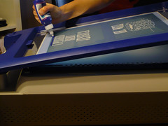
get your bead of ink across the top of the design and get to printin!

P1050644

it's a good idea to test print a couple of times on paper beforehand to make sure everything's gonna go to plan...

P1050645

money saving tip: you'll need to put ink at the top of the design again with almost every pulling of the print - if you look at your squeegee you've probably got a lot of excess on there that you can scrape off with a popsicle stick and put across the top of the design instead of using another bead of ink from the bottle!
P1050650

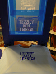
and POW! before you know it, you're done printing your first tee!

P1050656

and POW POW!!! before you know it, you're done printing a whole mess of tees! one of the things i love about the yudu is it really really helps me production-time-wise. printing tons of shirts used to take forever, but i did 60 tees in 6 hours today! that includes printing, stamping a logo inside at the neck and heat setting each tee individually. you really can't beat that!

P1050657

i ran into a tiny problem with another screen of mine - the transparency was too high up on the emulsion when i exposed the screen, and part of the apostrophe got cut off!
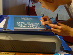
P1050660

no worries though, i busted out a tiny paintbrush and the yudu's screen blocking stuff and fixed it right up! i will tell you i think i may try speedball brand's screenblocking fluid in the future, because the yudu's seemed to wash out when i cleaned the screen later...
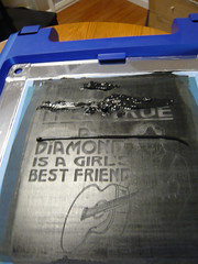
P1050663

if you have a larger tee design, it may be good to put a bead of ink across the top of the art, and then another bead of ink across the middle just in case!

potential problem alert! ok i did find one thing with the yudu that was giving me some issues this morning. it seems like some screens don't wanna stay on their pegs and they shift slightly. you don't believe me? here's proof!

P1050665 P1050665

it's really not a huge deal for me because i do all one-color desigsn for now. BUT - i kept getting subtle double fingers from my neil diamond screen! maybe it's too close to the edge of the emulsion? i dunno!

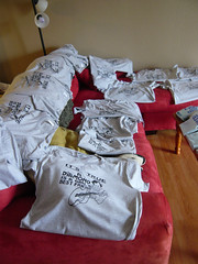
P1050667

P1050669

printing these neil diamond tees i can now tell you the 2oz bottle you receive with your yudu machine will be enough for about 16 large graphics. if you're using it for tiny graphics you'll get more for the money...

but what would be even better for the money is using a different brand of screenprinting inks... i kept reading everywhere that you are really only supposed to use yudu brand inks with this system. but they're so flipping expensive! i started thinking about how i've always used speedball fabric screenprinting inks, and how they're water soluabe just like the yudu inks... and then this happened:

P1050672

and i felt like i should probably give it a try and report back!

P1050674

and survey says DING DING DING! the tees i did with speedball ink turned out just as good AND rinsed out of the screen just fine at the end! hooray!

ok so if you're using more than one design on a screen, how do you line up the bottom image when you wanna print it?

P1050678

i do the same thing as with the top graphic - i put a piece of tape to mark the top of the artwork -
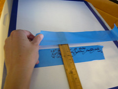
P1050681

and then i measure out where i want the shirt to line up in comparison with that top of the artwork. make sure this piece of tape is long enough so you can se it on the side of your tee when you're placing it on top of the platen!

P1050685

here's my classic steph's screenprinting pose! if you press your left arm down on the end of the screen and really lean into your print as you're pulling the squeegee across you'll get a nice amount of pressure and a crisp clear print. i like to pull my squeegee across twice so it's nice and dark!
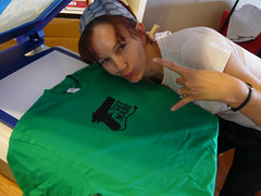
P1050688

check it out! i effing love this glue gun design and i've been wanting to burn a screen of this for ages - if you like it make sure you read to the end of this novel-length post for info on an awesome giveaway!

once i did one of those glue gun tees, i wanted to print that graphic on EVERYTHING! i'm not one for texty tees so i put tape over the words on the back of the screen and slapped that design on one of my sweatshirts!

P1050694

and then i went for the yoga mat!

P1050697

P1050701

but due to the texture of the mat and the thin quality of the speedball ink i used, the design came out really smudged on the yoga mat. i recommend on highly textured non-clothes stuff it may be better to use the yudu inks cuz they're a lot thicker.

P1050708

and all that smudging went up on the back of the screen, too - something i didn't think about until i tried screenprinting a pillowcase with the glue gun design...
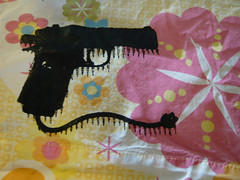
P1050710
(i still kinda like it though!)

and THEN i put it on a tee using the yudu gold metallic ink! i don't know if speedball has a shiny gold and silver fabric ink but if they don't the yudu brand is totally worth it!

P1050717

and THEN i made some of these notecards! i think they'd be fun invitations if you're planning a crafty party night a your house - or if you're in a craft mafia chapter (like me!) and you're inviting new members to join they'd also be super cute!

P1050702

and THEN i screenprinted my dog! i think it turned out pretty good, check it out:

P1050703

and that about does it for my adventures with the yudu today! it's time to talk CONTEST! first place gets the kelly green "get made" tshirt pictured in this blog post - i only have one available right now in an american apparel unisex size small, so if you don't wear that size and you win you can maybe give it to a friend or bake it into a pie! second place gets a turquoise "get made" greeting card!

here's how it works - this'll be a random drawing, and there's a few different ways to get chances to win, and you can participate in more than one of these to get extra chances:

1) comment about this blog post!

2) twitter a link to this blog post and send me the link as proof

3) post a link to this entry on your blog and send me a link as proof

4) write a haiku about screenprinting in the comments of this post

5) share a link to this blog post on facebook or myspace and send me a link as proof

you've got until friday may 15th at midnight so get cracking and have fun! winner will be chosen from random drawing and will be notified via email! GOOD LUCK!

Labels: , ,

5.09.2009

that voodoo that yudu so well - part 1, how i learned to stop worrying and love the yudu

ok i'm really bummed that i JUST found my camera that's been missing for a week or more - i wanted to photodocument getting to know my yudu better! it was gonna be perfect... photos of us taking long walks on the beach, romantic candlelit dinners, canoodling at the movies - but instead you get just boring old stupid words!

except sometimes my words have been known to be at least a little entertaining.

but still. the plans i had for the pictures.

ugh. i'm buildig a bridge and getting over it!

so as i mentioned before, my superawesome amazing faboo rad honkytonk husband josh surprised me (us, we're sharing it, i keep forgetting that!) with one of those spanky new fancy yudu machines a couple of weeks ago! and i was so busy getting ready for Unique LA and workin on freelance projects on top of freelance projects that i juuuuuust got to crack that baby open last night!

i have to tell you that i've done the regular way of screenprinting before, and i was a tiny bit skeptical the first time i saw a yudu. it's by the same people that brought you the cricut, which is great for scrapbookers but not so much for people that wanna make their own die cut designs... i don't wanna be rude but my first impression was i kinda thought that it would be a very lowest common denominator type thing that would make low quality stuff for folks who just don't wanna be bothered with learning how to really screenprint. then i saw the yudu display at michaels, and started reading labels and kinda learning more about it, and had to tell josh very sheepishly "uh hey i know when you mentioned it i said it was dumb, but, uh, i kind of really super want a yudu. like really bad. so uh... sorry, and my birthday's coming up in july hint hint"...

and he ended up buying it early thank god! so far i am a total screenprinting convert and i'll tell you why:

1) shit on the yudu is all the same steps as traditional screenprinting but easier (once you get the hang of it). there's still emulsion and darkroom scenarios, but it's less time consuming!

2)if you mess up on burning a screen, it doesn't take a crapload of work and scrubbing to reclaim your screen - it takes like a minute. in your kitchen sink. while you hum to yourself. i have old-school wood frame screenprinting screens that haven't turned out right (from like YEARS ago) that i still haven't reclaimed because it's a huge pain in the ass!

3) as far as i can tell so far, the quality of the actual screens and supplies isn't inferior to old-school screenprinting. they say don't use any other inks but yudu inks, but i did find a website that tested using riso inks (like for the gocco) on the yudu screens and it worked fine. and they're cheaper. i'll be testing using the speedball fabric screenprinting ink i normally use in the future, will letcha know how that goes!

if you've never seen a yudu before totally check out the demo from handmade detroit, it's a good one!

so here's how burning the screens for the first time worked out for me: i burned some screens after watching the demo video and following yudu's specific directions and none of those screens turned out right. i reclaimed the same screen like 3 or 4 times. and then i got tired. later i came back to it, tried a few different things, and EVERY screen came out effing perfect.

so without further ado, here's my tutorial tips on how to prepare the perfect yudu screenprinting screen for exposing!

1) mood lighting: keep your lights dim the entire time so you don't forget what you're doing and ruin your emulsion sheet! i wrecked one by going into the kitchen to get something and flipping on a light - FAIL!

2)wet it and forget it: forget about the "dont get the screen too wet" part of yudu's instructions. i ran my screen under the kitchen faucet from the front and reverse side. then i wipe off the extra drippy water from the metal screen edges.

3) lay it on me sistahpants! so now (IN YOUR DIMLY LIT ROOM!!! NO DIRECT LIGHTING!) take your emulsion sheet and peel the plastic sheet off the side that comes off easy - then put it sticky side down on the back of your screen (the flat side), being careful to center it as you lay it down. (can't tell which is the sticky side? lick your finger and touch a corner, you'll figure it out real quick!) run your squeegee down it lengthwise, and then widthwise making sure to press out all the air bubbles.

then comes my special trick to make sure it's wet enough - holding it in your hand, look at the screen from the opposite side. lightly lightly spray that other side a couple of times with a water bottle, and run your squeegee once lengthwise along the screen. (from that side you just sprayed).

at this point, the green emulsion should look really even on both sides. if you've got any areas that look splotchy (they call it spiderwebby) you're not going to have a good end result. it should look really good and clean and even after doing my special trick. if not, try misting it again from that reverse side.

note: if your emulsion looks effed up before you dry it and expose it, you will end up with a bad screen. best to try again with a fresh sheet instead of going through the whole process to find out later it didn't turn out how you wanted it.

also note: drying time for my techniques is significantly longer than following yudu's instructions to the letter, but the results have been great every time.

also also note: your mom called and told me you're out of the family. sorry!

so the rest of it is business as usual following yudu's instructons:

4)dry that shit! after your emulsion looks lovely, put that screen in the drying rack and run the fan on it! using my method with more wetness involved, i think i averaged three to four 20-minute dry cycles before the screen was dry enough for exposing. you'll know when it's dry enough when it looks really even (and not wet at all) on both sides. test it by picking the plastic backing off the emulsion in a corner and peeling a tiny bit of it off. if it comes off really easy you're done! if it doesn't DON'T FORCE IT! put that thing back in the dryer and let it dry!

5) picture perfect pictures! ok one thing i tried from my old-school screenprinting techniques is i ran outta yudu transparencies, so i used vellum instead to print my image on. and i don't know if it was because that was a screen i did at like 2am and i think i messed up a bunch of things or what, but the vellum did NOT work at all. so don't do it! i do really like the yudu brand transparencies - they have a little bit of a tooth to em, so the images don't get all smeary when they come outta my inkjet printer.

from that point on i did pretty much everything to yudu's specifications - exposed the image for 9 minutes instead of 8 cuz i like to go the extra mile just to be sure, rinsed out the screen with cold water, and every one i've done since i started following these techniques has come out AWESOME.

oh wait one more thing. when you're done burning your screen and you've rinsed the unexposed green gunk out, i don't think it's necessary to use the yudu's fan for drying it. if you've got the time just blot off the excess water and set it up against a wall for a bit to dry. if you don't got the time hairdryer that shit!

another exciting thing i wanna share about the yudu is that i have a graphic i designed like 4 years ago that i've tried burning to screens the old fashioned way like 4 or 5 times with zero success because the line work was a little fine and frankly i'm not the best screen-burner in town. but following the above techniques i was FINALLLY able to get a clean burn of that image onto the screen and i am really effing excited about that! because it's pure comedy and it makes me chuckle!

so anyways, that's it for tonight - i'll be testing out the printing tomorrow, and like i said i found my camera so expect to see pics of the screens i burned and the printing process! pow!

Labels: , , ,

3.28.2009

hearts and laserbeams how to: repeat yourself, repeat yourself part 4!

part 4: check yourself before you wreck yourself!

ok so you've got your repeat pattern finished in either illustrator or photoshop - the most important thing comes next, making sure your repeat works! spoonflower's a little spendy, so it would suck if you spent the money to get your fabric printed up and then got it in the mail all honked up with little chunks missing! in this last and final installment we'll go over how to check your repeat and make sure it works and get that shit ordered!

(ps sorry for the delay in writing this part folks! i have a new on-site freelance gig going on right now so i need to rework how my blogging goes so i can keep you elbow deep in fresh posts!)

so let's get to it!

photoshop instructions:

1) open the photoshop file we've been working with! first off we're going to group your repeat's layers together to make em easier to work with in checking your work.
in your layers window, click on the create new group button:


name this group "red polka dot". click on your top (a polka dot) layer, hold down shift and click on your red background layer. you should see all of your repeat layers selected now - drag them into that group folder.


2) now we'll make your canvas size a lot bigger so we can repeat this group and check to see if all the edges match up! using the menus up top, choose image > canvas size. enter 16 inches for both the x and y values, and then on the grid of squares click on the top left. click on ok.


3) next make a copy of your polka dot group! right-click on your group, and choose duplicate group. do this 2 more times, so you have a total of four groups - your original, and 3 copies.


4) select one of those groups, and from the top menus choose edit > free transform. just like before, make sure the little triangle in the options bar up top is dark (click to make it dark if it isn't), and then set the x value to 8 in and the y value to 0 in, then hit enter. one of your groups should have moved over!


5) select another one of the groups, choose edit > free transform, set the x value to 0 in and the y value to 8 in, hit enter. another one moved!


6) select another one of the groups, choose edit > free transform, set the x value to 8 in and the y value to 8 in, hit enter. you should now have a block full of dots!


7) at this point you should check to make sure all your edges of your repeat matches up where everything hits everything else - if you're doing a tossed pattern this is also a great time to check and make sure there's no weird holes in your design! if there's a problem you gotta go back and figure out what went wrong, but if everything looks good you're golden and ready to set up your file to order!

8) we're gonna go back to your file before you made all those copies with the magic of the history window! using the menus up top, select windows > history. what you'll see there is all the stuff you've done to this file for the last 10-15 steps! click on the item right before "canvas size". (grouping is nice, so no need to undo that!)


it should look like you're back to where you started!


9) save that shit!

10) now we'll save the file you'll upload to spoonflower. from the top menues, select file > save as. set your format to tiff, and UNCHECK the box that says layers. (layers will make your file HUGE!!!) and click save! then click ok! then you're almost done!

11) go to the folder where you saved your file and double check that it's less than 25 megabytes - if it's bigger than 25 megs and you've started with a file that's in lab color and 300dpi, don't fret! spoonflower's printers print at 150dpi. if you're having this problem, you can open your tiff file and go to image > image size. you can change the resolution to lower and lower increments to see how much smaller you can make the file, but DON'T GO BELOW 150 DPI!!!

AND THAT IS IT!! you've made a repeat in photoshop, saved the tiff and are ready to order from spoonflower! but what if you've created your file in illustrator?

illustrator instructions
(guess what, it takes a lot less work to check your file in illustrator!)

1) open the illustrator file you're working with. with the dark arrow at the top of the tools window selected, click on the red background. using the menus up top, choose edit > copy and then edit > paste in back. WITHOUT DESELECTING THIS SQUARE, change the fill and stroke to have no color. you shouldn't see any change on the screen because this square's behind everything else on the page AND it's color is essentially set to invisible!

2) making sure your dark arrow at the top of the tools window is selected, drag a box around your entire repeat. using the menus up top, choose windows > swatches. drag your repeat into this window.


3) you should now see a tiny swatch of your repeat in this window! hooray! in the tools window, select the rectangle tool. make sure your repeat swatch is selected in the swatches window - off to the side of your file, click on the screen. you should get a dialog box asking for dimensions. set both the x and y values to 16 inches.


4) voila! you should see a big ol chunk of your repeat! make sure all your elements are intact and there's no little chunks missing anywhere!


5) if it all looks good go ahead and delete that huge swatch so all you have left is your original repeat. looking at the menus up top, choose file > export. set where you'd like to save it and choose .tif for the file format, and hit ok. set the color to cmyk and the resolution to 300 dpi, make sure the box for anti-alias is checked and hit okay.

6) you're not quite done yet! now you're take this tiff and put it in the correct color format for spoonflower! it's no worries, super easy peasy - go into photoshop, open the tiff you just saved from illustrator. using the up top menus, choose image > mode > lab color.

7) save it! done! finito! go to the folder where you saved your file and double check that it's less than 25 megabytes - if it's bigger than 25 megs and your tiff is in lab color and 300dpi, don't fret! spoonflower's printers print at 150dpi. if you're having this problem, you can open your tiff file and go to image > image size. you can change the resolution to lower and lower increments to see how much smaller you can make the file, but DON'T GO BELOW 150 DPI!!!

AND THAT IS IT!! if you follow the four parts of this tutorial step by step you will be makin repeats like a madman in no time - hope they were super helpful to you; the next hearts and laserbeams how-to will be about creating animated gifs, wokka wokka doo doo yeah!

Labels: ,

3.23.2009

hearts and laserbeams how to: repeat yourself, repeat yourself part 3!

part 3: making a simple repeat pattern!

ok breaktime's over folks let's get back into it! today we're gonna talk about how to make a simple polka dot repeat in both photoshop and illustrator. you can apply this exact same technique to pretty much anything you want to repeat!

THE most important thing to remember when you're building your repeat is anything that cuts off on one side of your repeat's box MUST finish on the other side of your box.

let's take a look at that simple heart repeat from part 1:


note how the top heart ends right along the top left corner. now look to the right of that repeat box - the next heart starts exactly on the other side of the right edge. the lower heart inside the repeat box, see how it falls under that red box line just a little bit? take a look at the left side of the box - that heart also falls under that repeat's border, with that same little tiny slice of heart! make sense? no? (if not let me know and i'll explain again; not sure if that came across right.)

so any element that ends on the left side of the repeat box MUST finish on the right side of the repeat box. same thing for any element that ends at the top of the repeat box - it MUST finish at the bottom of the repeat box. take a look again at the multicolored hearts from part 1, it'll be a little clearer:


ok so we've got that part, right? and you've got your file set up - let's make a simple polka dot!

creating a polka dot in photoshop
1) open your file that you created in part 2 of this tutorial!


2) make a new layer called "polka dot 1". (see part 2 of this tutorial for how to make a new layer) make sure this layer is highlighted in the layers window so it's the layer you're putting this first dot on.

3) set your chosen foreground color to black - see where you set the color to red in part 2 for how to change it.

4) select the ellipticle marquee tool in your tools window (remember you can click on any of these images to see em bigger!):


5) now you'll make a dot on your page! holding down the shift key, left-click and drag a circle on your document. holding down the shift key locks the proportions into a perfect circle - you don't have to hold it down, but you most likely will get an oval and not a circle if you don't... you'll now see a blinking circle.

don't stress out over where to make your circle, these directions will work no matter where you put your circle. don't stress about how big to make it either, that's all up to you!

6) select your paintbucket (see part 2 for how to do this)

7) fill your blinking circle with black!


8) using the menus at the top of your screen, click select > deselect

9) ok now we'll make an exact copy of that dot in that exact spot on another layer! making sure you select your dot layer, click and drag it to the new layer icon at the bottom of the layers window.


you should now see a layer appear that is the same as the layer you copied - it'll have the word copy at the end of that layer's name:


10) make sure your newly-copied layer is highlighted in the layers window, and that the black arrow is selected from the top of the tools menu. you'll be moving the dot to a new position! from the menus at the top of the screen, pick edit > free transform. now look at the options bar at the top of your screen, and click the little triangle so that it's a dark grey color.


11) set the x value to 4 in and the y value to 4 in - you'll most likely have to put the "in" for inches after your numbers! watch your dot move; so magical!


now check out the above picture - our second dot is cut off! if this repeat was sent to spoonflower as is, you'd get your fabric back with one good dot and one dot that's missing a chunk. so! do this:

12) make a copy of that copy layer by clicking and dragging it to the new layer icon in the layers window. on the top layers menu, choose edit > free transform. making sure that triangle icon is dark grey, set your x value to -8 in and your y value to 0. you should now see a tiny chunk of circle on the other side of your 8" x 8" repeat!


and that's it! you've just made a repeat! let's check out how it's done in illustrator:

creating a polka dot in illustrator
1) open the illustrator file we created in part 2.

2) select the ellipse tool from the tools window.


3) set the foreground color to black (see part 2 for how to do this)

4) with the ellipse tool selected, click somewhere inside your red square - set the x and y values to 2" (or however big you want your dots to be).


hit ok, and you'll see a dot on your square!


now we're gonna make another one of those dots right on top of that one (just like copying that layer in the photoshop instructions). make sure the dot you made is still selected, and from the menus at the top of the screen choose edit > copy. then choose edit > paste in front.

you should not see anything change here, because the dot is right in front of the first one you made. it should still be selected! from the menus up top choose edit > transform > move. you'll get a popup box, and you should set the x value to 4 in and the y value to -4 in. if you click on the preview box, you'll see where it's going to move to! hit ok and it's moved!


in this example the dots are both contained inside the square. if your second dot is cut off on the side of the box though, its an easy fix! select that second dot, copy and paste it in front,and then move it, setting the x value to -8 in and the y value to 0. donezo!

if you want to move your dots so they're contained in the box, you can do that to - using the black arrow you'll just select dot 1, hold down shift and select dot 2 (shift lets you select multiple objects), and then move them to their new position! you just want to make sure your dots stay the same distance from each other or else your repeat won't be a standard polka dot (which may be what you're going for! in that case do whatever suits you!)

and that's it for now! we've created a repeat in photoshop and a repeat in illustrator - next i'll show you how to test them to see if they'll work as a repeat!

do you have any questions on this part of the tutorial? ask away, ill help ya out!

Labels: ,